Accessing NWM Forecasts using Google BigQuery
Description
The purpose of this notebook is to access a subset of the data products created by the operational National Water Model. A comprehensive description of these data products can be found at water
Software Requirements
This notebook has been tested using Python v3.11.8 using the following library versions:
matplotlib==3.8.3
pandas==2.2.1
geopandas==1.0.1
shapely==2.0.3
ipyleaflet==0.18.2
sidecar==0.7.0
ipywidgets==8.1.2
The following utility files and credentials are required to run this notebook:
The
creds.pyPython file containing credentials to authenticate our queries with the CIROH BigQuery APIThe
utilspackage containing helper functions for retrieving National Water Model time series data using the BigQuery API and for generating interactive maps of model features
Introduction to CIROH Big Query API and Parameter Setup
We’ll be accessing operational National Water Model predictions using the CIROH Big Query API. In order to do so, we’ll need to use an access key provided by the Alabama Water Institute (AWI). Instructions for doing so can be found at DocuHub. This capability has been established through CIROH research and a complete description of its design and implementation can be found in the paper entitled: “Design and implementation of a BigQuery dataset and application programmer interface (API) for the U.S. National Water Model”.
This project ingests operational NWM predictions, which are stored in NetCDF files, into a cloud optimized tabular structure. This makes a once onerous task of accessing these timeseries data a highly efficient and streamlined process. The general architecture for enabling this capability is outlined in the graphic below:
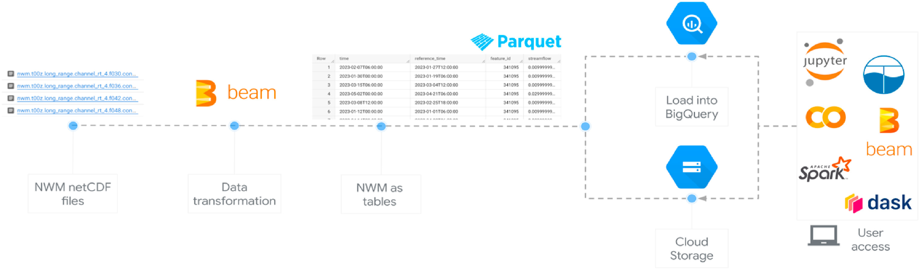
Overview of workflow
The workflow in the notebook does the following:
Read Analysis and Assimilation Data
Read Forecast Data
Collect Forecast Data for Multiple Reference Times
Creating and Interactive Map
Import Required Python Libraries and Set Credentials to Authenticate
import io
import creds
import pandas
import requests
import numpy as np
import matplotlib.pyplot as plt
We’ll use the creds.py credentials to authenticate our queries with the CIROH BigQuery API. These need to be passed in the header of each each request we make. Define the header information, which we’ll reuse throughout the notebook.
From the top JupyterHub menu, click on File → New → Python File
Once credentials have been obtained by the AWI, they should be saved in a file named creds.py. We’re saving our credentials in a separate file so that they are not displayed in the notebook and remain a secret. This file should contain two variables:
key="<INSERT API KEY HERE>"
url="https://nwm-api.ciroh.org"
API_KEY = creds.key
API_URL = creds.url
header = {
'x-api-key': API_KEY
}Case Study: Flooding in Vermont (July 2023)
“A major storm caused catastrophic flooding across Vermont between July 9–12, 2023, resulting in millions of dollars in damages.” The high amount of rainfall caused several rivers to peak at record levels, in some cases surpassing records set during Tropical Storm Irene in 2011. The U.S. Geological Survey, in cooperation with the Federal Emergency Management Agency, collected and analyzed data on peak water-surface elevations, peak streamflow, and annual exceedance probabilities at streamgages, lake gages, and selected ungaged locations.
Of 80 streamgages monitored (with records spanning 12 to 94 years), 11 recorded their highest peak streamflows on record, and another 10 exceeded the 100-year recurrence interval threshold. Notably, 20 out of 45 monitored sites reported higher peak flows in 2023 than during Irene.
Seventeen rivers were surveyed for high-water marks for both events. At 32 of the 103 sites, water levels during the 2023 flood were higher than those in 2011.
Federal assistance exceeded $54.7 million following a disaster declaration by President Biden. All 14 counties in Vermont received public aid, with 9 also qualifying for individual support.
For more details, see the full report: Flood of July 2023 in Vermont (USGS, 2024)
Londonderry, Vermont before and after the storm.
| Before the storm | After the storm |
|---|---|
 |  |
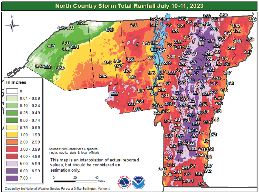
Figure: Map from the National Oceanic and Atmospheric Administration webpage showing the 48-hour rainfall totals (in inches) from July 10–11, when most of the rainfall occurred, in Vermont and northern New York; from Banacos (2023).
For our analysis we’ll focus on the West River at South Londonderry, VT during the period of July 9–12, 2023.
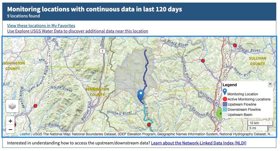
Define inputs for location/period of interest
reach_id = 10102374
start_time = '2023-07-01'
end_time =  '2023-07-20'
output_format = 'csv'
Read Analysis and Assimilation Data
Build the API request to collect the NWM analysis and assimilation predictions. Analysis and Assimilation refers to a process that combines observed data with model simulations to produce the most accurate possible estimate of current conditions, known as the model state. These states are saved as restart files for forecast initialization. The model uses a lookback period (the amount of past time that a model considers) to ingest recent observations, improving streamflow estimates. Note: Only streamflow is assimilated!
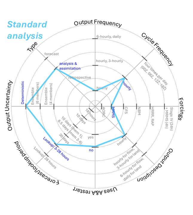
Figure is developed based on information from https://
The CIROH BigQuery API endpoint for the analysis and assimilation data accepts the following input parameters:
Analysis and Assimilation Input Parameters
| Argument | Type | Description |
|---|---|---|
start_time | str | None | The start time of the data range. Defaults to None. If None, defaults to "2018-09-17T00:00:00". |
end_time | str | None | The end time of the data range. Defaults to None. If None, defaults to the current time. |
comids | str | None | A comma-separated list of reach IDs for the forecast. Defaults to None. Example: "15039097,1239657". |
hydroshare_id | str | None | The HydroShare ID with specified comids to extract the forecast. If comids is not provided, this will be used to extract comids. Defaults to None. Example: "643dc03878704a30849536e302bdb2c0". |
output_format | str< | The format of the analysis-assimilation response data. Defaults to 'json'. Supported values: 'json', 'csv'. |
run_offset | int | The analysis-assim result time offset. Defaults to 1. Supported values: 1, 2, 3. |
ENDPOINT = f'{API_URL}/analysis-assim'

params = {
    'comids': reach_id,
    'start_time': start_time,
    'end_time': end_time,
    'output_format': output_format,
}

print(ENDPOINT)
print(params)
https://nwm-api.ciroh.org//analysis-assim
{'comids': 10102374, 'start_time': '2023-07-01', 'end_time': '2023-07-20', 'output_format': 'csv'}
Call the API using the Python requests library to collect data.
r = requests.get(ENDPOINT,
                 params=params,
                 headers=header)
A Python requests object is returned by the previous cell which contains lots of information about the HTTP request and response. One thing that we should always check is the status code of the response, specifically we want to make sure that the request was successful which would result in an 200 code. For more information about HTTP status codes, see this Wikipedia article.
if r.status_code == 200:
    print('Request was Sucessful ;)')
else:
    print(f'The request was not successful: {r.status_code}')
Request was Sucessful ;)
Let’s preview the response that we recieved from the CIROH BigQuery API. This will be in csv format since that’s what we specified in the request parameters (i.e. output_format: csv). There could be a large amount of data in our response, so let’s just view the first 1000 characters so we can see the format of the API response.
# print the first 1000 characters of the response.
print(r.text[0:1000])
feature_id,time,streamflow,velocity
10102374,2023-07-01T00:00:00,2.8299999237060547,0.6699999570846558
10102374,2023-07-01T01:00:00,2.93999981880188,0.6800000071525574
10102374,2023-07-01T02:00:00,2.919999837875366,0.6800000071525574
10102374,2023-07-01T03:00:00,3.0299999713897705,0.6800000071525574
10102374,2023-07-01T04:00:00,3.0799999237060547,0.6899999976158142
10102374,2023-07-01T05:00:00,3.059999942779541,0.6899999976158142
10102374,2023-07-01T06:00:00,3.0899999141693115,0.6899999976158142
10102374,2023-07-01T07:00:00,3.0999999046325684,0.6899999976158142
10102374,2023-07-01T08:00:00,3.259999990463257,0.699999988079071
10102374,2023-07-01T09:00:00,3.2100000381469727,0.699999988079071
10102374,2023-07-01T10:00:00,3.309999942779541,0.7099999785423279
10102374,2023-07-01T11:00:00,3.240000009536743,0.699999988079071
10102374,2023-07-01T12:00:00,3.2100000381469727,0.699999988079071
10102374,2023-07-01T13:00:00,3.0999999046325684,0.6899999976158142
10102374,2023-07-01T14
Convert the raw data into a Pandas Dataframe so we can work with it a bit easier.
df_analysis = pandas.read_csv(io.StringIO(r.text), sep=',')
df_analysis.set_index('time', inplace=True)
df_analysisWe can plot these data very easily using built-in Pandas functions.
df_analysis.streamflow.plot(grid=True,
                            rot=45,
                            title=f'Streamflow for NWM {reach_id}',
                            ylabel='Streamflow (cms)');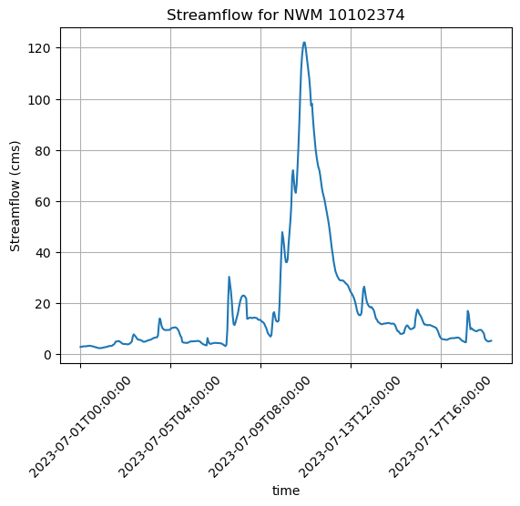
Read Forecast Data
Forecasts are generated using data from numerical weather prediction models (e.g., HRRR, NBM, CFS) and are initialized using Analysis & Assimilation outputs to simulate future hydrologic conditions such as streamflow and snowmelt.
Short Range Forced with meteorological data from the HRRR and RAP models, the Short Range Forecast configuration cycles hourly and produces hourly deterministic forecasts of streamflow and hydrologic states out to 18 hours. The model is initialized with a restart file from the Analysis and Assimilation configuration and does not cycle on its own states.
Medium Range The Medium Range Forecast configuration is executed four times per day, forced with GFS model output. Member 1 extends out to 10 days while members 2-6 extend out to 8.5 days. This configuration produces hourly and 3-hourly deterministic output and is initialized with the restart file from the Analysis and Assimilation configuration.
Long Range The Long Range Forecast cycles four times per day (i.e. every 6 hours) and produces a daily 16-member 30-day ensemble forecast. There are 4 ensemble members in each cycle of this forecast configuration, each forced with a different CFS forecast member. It produces 6-hourly streamflow and daily land surface output, and, as with the other forecast configurations, is initialized with a common restart file from the Analysis and Assimilation configuration.
For more details, see the full report: Using the National Water Model Within NWPS
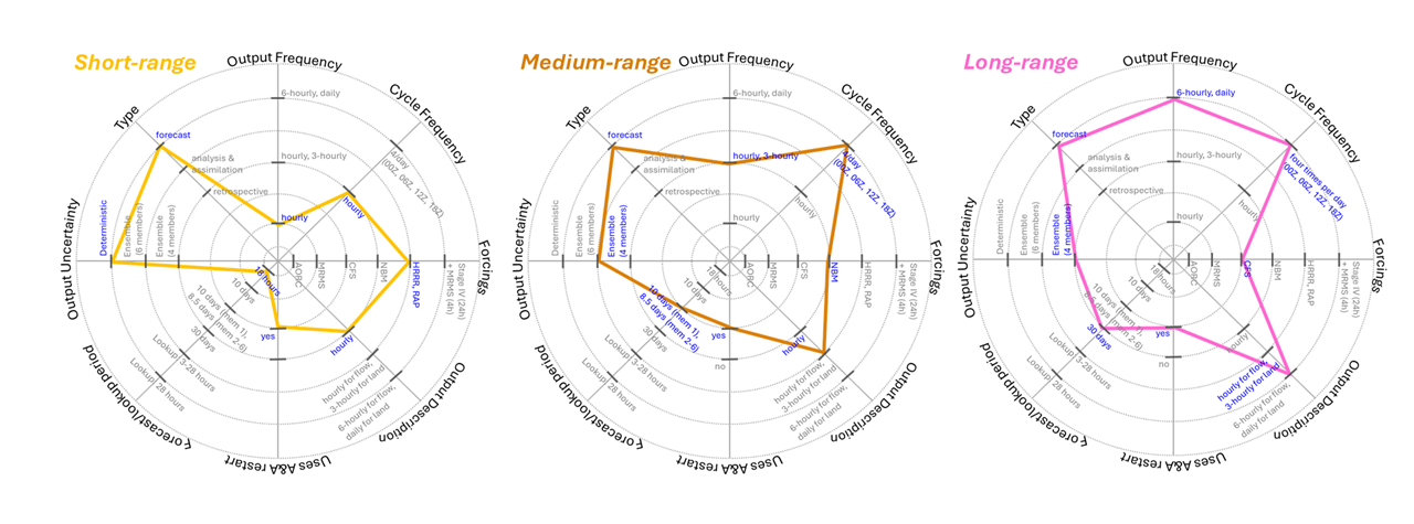
Figure is developed based on information from https://
The CIROH BigQuery API endpoint for forecast data takes the following input parameters:
Forecast Input Parameters
| Argument | Type | Description |
|---|---|---|
forecast_type | str | The forecast run to extract data from. Supported values are 'long_range', 'medium_range', and 'short_range'. |
reference_time | str | None | The reference time for the forecast. If None, defaults to the latest available forecast reference time in the specified table. Example: "2023-11-25 06:00:00 UTC". |
comids | str | None | A comma-separated list of reach IDs for the forecast. Defaults to None. Example: "15039097,1239657". |
hydroshare_id | str | None | The HydroShare ID with specified comids to extract the forecast. If comids is not provided, this will be used to extract comids. Defaults to None. Example: "643dc03878704a30849536e302bdb2c0". |
ensemble | str | None | A comma-separated list of ensembles for the forecast. If None, the average of all available ensembles is used. Supported values: 0 for short_range, 0–5 for medium_range, and 0–3 for long_range. |
output_format | str | The output format for the forecast dataset. Defaults to 'json'. Supported values are 'json' and 'csv'. |
Define input parameters for our request.
forecast_type = 'medium_range'
ensembles = '0,1,2,3,4,5,6'
reference_time = '2023-07-05'
Build the API query object.
ENDPOINT = f'{API_URL}/forecast'

params = {
    'comids': reach_id,
    'forecast_type':  forecast_type,
    'reference_time': reference_time,
    'ensemble': ensembles,
    'output_format': output_format,
}
Call the API using the Python requests library to collect data.
r = requests.get(ENDPOINT,
                 params=params,
                 headers=header)

if r.status_code == 200:
    print('Request was Sucessful ;)')
else:
    print(f'The request was not successful: {r.status_code}')
Request was Sucessful ;)
Convert the raw data into a Pandas Dataframe.
df = pandas.read_csv(io.StringIO(r.text), sep=',')
df.set_index('time', inplace=True)
dfWe forecasts generated from multiple ensemble members. Let’s plot these on the same axis so we can see how they differ.
df.groupby('ensemble')['streamflow'].plot(grid=True,
                                          rot=45,
                                          legend=True,
                                          title=f'Forecasted Streamflow for NWM {reach_id} Grouped by Ensemble');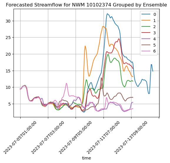
Another way to visualize these data is by plotting their interquartile range. This will help us visualize theses collection of forecasts behave over time, as a shaded area with an upper bound of the 75th percentile and lower bound of the 25th percentile. This is effective in reducing visual clutter while also showing the agreement/disagreement between each forecast. A wide band of shaded area represents disagreement (or higher uncertainty) between series, where as a narrow shaded area represents agreement (or low uncertainty).
iqr = df.groupby(df.index)['streamflow'].quantile([0.25, 0.75])
iqr = iqr.reset_index()
iqr = iqr.rename(columns={'level_1': 'quantile'})

df_pivot = iqr.pivot(index='time', columns='quantile', values='streamflow')
df_pivot.index = pandas.to_datetime(df_pivot.index)

# Plot the time series for each group
plt.figure(figsize=(10, 6))
plt.fill_between(df_pivot.index, df_pivot[0.25], df_pivot[0.75], color='gray', alpha=0.3);
plt.xticks(rotation=25)

plt.grid(True)
plt.title(f'IQR of Forecasted Streamflow for NWM {reach_id}')
plt.ylabel('Streamflow (cms)')
plt.xlabel('Date')
plt.tight_layout()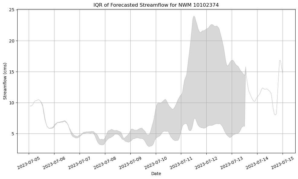
Collect Forecast Data for Multiple Reference Times
We can also collect data for multiple forecasts through time. To assist with this, we’ll use a utility library called utils.forecast. This library wraps the forecast request above in the concurrent.futures class which enables us to make parallel requests. This will speed up the collection of data.
from utils import forecast
from datetime import datetime, timedelta
Instantiate the utilities library by passing it our BigQuery key.
forecasts = forecast.Forecasts(creds.key)Define several reach ids to collect data for. In this scenario, we’re only interested in the first ensemble member.
comids = [10102374, 10102316, 10102406]
forecast_type = 'medium_range'
ensembles = [0,1,2,3,4,5,6]
Create a list of times for which data will be collected. In the cell below, we define a start time and dynamically generate a list of dates that will be sent to the CIROH BigQuery API.
# start time
start_date = datetime(2023, 6, 28)

# Number of days to increment (for example, 10 days)
num_days = 20

# Create a list of dates incrementing by day
reference_times = [(start_date + timedelta(days=i)).strftime('%Y-%m-%d') for i in range(num_days)]

print("Generated Reference Times:")
for reference_time in reference_times:
    print(reference_time)
Generated Reference Times:
2023-06-28
2023-06-29
2023-06-30
2023-07-01
2023-07-02
2023-07-03
2023-07-04
2023-07-05
2023-07-06
2023-07-07
2023-07-08
2023-07-09
2023-07-10
2023-07-11
2023-07-12
2023-07-13
2023-07-14
2023-07-15
2023-07-16
2023-07-17
Collect medium_range forecasts for each of the comids specied above, for each of the times generated in the previous cell.
forecasts.collect_forecasts(comids,
                            forecast_type,
                            ensembles,
reference_times)Let’s double check that we received forecast data for multiple reaches and multiple days.
for fid in forecasts.df.feature_id.unique():
    num_timesteps = len(forecasts.df.loc[forecasts.df.feature_id==fid].time.unique())
    num_ref_times = len(forecasts.df.loc[forecasts.df.feature_id==fid].reference_time.unique())
    print(f'Reach ID: {fid}')
    print(f'\tNumber of Ref Times: {num_ref_times}')
    print(f'\tNumber of Timesteps: {num_timesteps}\n')
Reach ID: 10102374
Number of Ref Times: 1
Number of Timesteps: 240
Reach ID: 10102406
Number of Ref Times: 1
Number of Timesteps: 240
Reach ID: 10102316
Number of Ref Times: 1
Number of Timesteps: 240
Preview the data for one of these reaches.
fig, ax = plt.subplots(figsize=(10, 6))

for reference_time, group in forecasts.df.groupby('ensemble'):
    group.plot(x='time', y='streamflow', ax=ax, label=str(reference_time), legend=False, color='k', linestyle="", marker='.')

ax.grid(True)
ax.set_title(f'Forecasted Streamflow for NWM {reach_id} from 6/29/23 - 7/17/23')
ax.set_ylabel('Streamflow (cms)')
ax.set_xlabel('Date')
plt.show()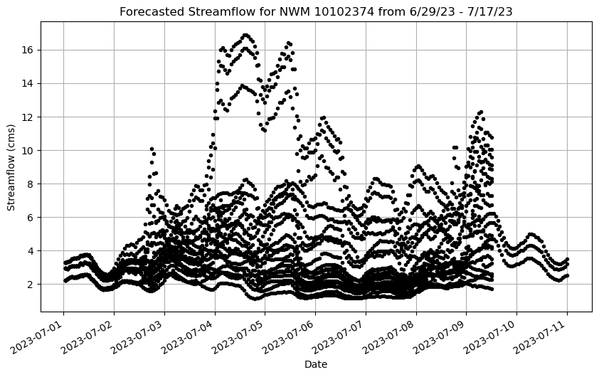
When we’re looking at many timeseries, it can sometimes be helpful to visualize the interquartile range. This descibes the middle 50% of the values at each timestep and shows were the forecasts align.
# compute IQR for the ensembles of each forecast.
dats = []
for ref_time, forecast_grp in forecasts.df.groupby('reference_time'):
    iqr = forecast_grp.groupby(forecast_grp.time)['streamflow'].quantile([0.25, 0.75])
    iqr = iqr.reset_index()
    iqr = iqr.rename(columns={'level_1': 'quantile'})
    df_pivot = iqr.pivot(index='time', columns='quantile', values='streamflow')
    df_pivot.index = pandas.to_datetime(df_pivot.index)
    dats.append(df_pivot)
For a single forecast, this would look something like this:
fig, ax = plt.subplots(figsize=(10, 5))
ax.plot(pandas.to_datetime(df_analysis.index),
        df_analysis['streamflow'],
        label='Analysis Streamflow',
        color='black')


ax.fill_between(dats[0].index,
                    dats[0][0.25],
                    dats[0][0.75],
                    color='blue',
                    alpha=0.1,
                    zorder=2);

ax.collections[-1].set_label("Medium Range Forecast IQR")
ax.grid(True, color='lightgray', alpha=0.6, zorder=1)
ax.set_ylabel('Streamflow (cms)')
ax.set_xlabel('Date')
plt.legend()
plt.xticks(rotation=45)
plt.tight_layout()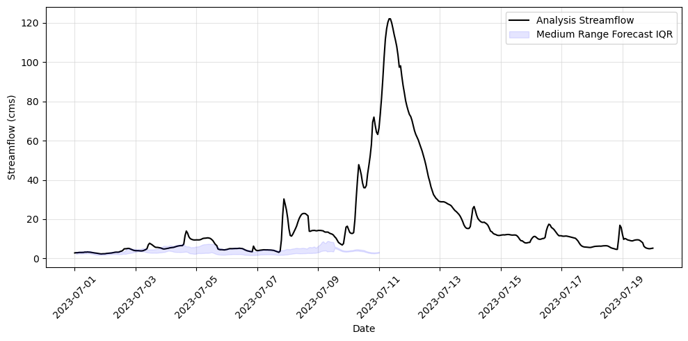
If we plot the IQR for all the forecast series that we collected in a semi-transparent manner, the areas appearing darker show us where the forecasts are in agreement.
fig, ax = plt.subplots(figsize=(10, 5))
ax.plot(pandas.to_datetime(df_analysis.index),
        df_analysis['streamflow'],
        label='Analysis Streamflow',
        color='black')
for i in range(0, len(dats)):
    ax.fill_between(dats[i].index,
                    dats[i][0.25],
                    dats[i][0.75],
                    color='blue',
                    alpha=0.1,
                    zorder=2);

ax.collections[-1].set_label("Medium Range Forecast IQR")
ax.grid(True, color='lightgray', alpha=0.6, zorder=1)
ax.set_ylabel('Streamflow (cms)')
ax.set_xlabel('Date')
plt.legend()
plt.xticks(rotation=45)
plt.tight_layout()
Creating an Interactive Map
We’ve included a utility library to demonstrate how these CIROH BigQuery API capabilities can be used in an interactive mapping interface. Reading through the code for producing this map interface is left as an exercise for the reader to complete. The relevant code can be found in the ForecastMap class within ./utilities/forecast.py
f = forecast.ForecastMap(creds.key)
f.asSideCarMap()References
https://
www .sciencedirect .com /science /article /pii /S1364815224001841 Banacos, P., 2023, The great Vermont flood of 10–11 July 2023—Preliminary meteorological summary: National Weather Service web page, accessed February 28, 2024, at https://
www .weather .gov /btv /The -Great -Vermont -Flood -of -10 -11 -July -2023 -Preliminary -Meteorological -Summary https://
storymaps .arcgis .com /stories /c4964f08ffcf4d9286bd1fd545ddfbab ?play = true & speed = medium